MarkPad: Day 3
5 January, 2012The first few days of the first project (MarkPad) were retroactively blogged about because we only decided to do that after the fact.
While day two was "slow", day three was anything but. An icon, a UI overhaul, and so many features.
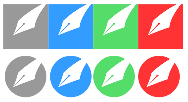
The Logo
One of the good and bad things about an adhoc, democratic app is that everybody has a say. This has led to some great UI or logic choices, but on the flipside has also had a few instances of where nobody could agree and executive decisions has to be made. For the icon, we had two shapes and many colours to pick from!

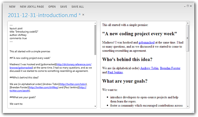
UI overhaul
It was voted that the anything resembling the "Fluent UI" (Ribbon) should be nuked from orbit, and instead we opted to go for a metro look. Thankfully, we all knew a guy who knew a guy who had a WPF Metro Library.

The design was inspired by (and permitted!) ClindHartsen's "Focus Text Editor"
We also introduced Awesomium as the preview control to make up for the lacking capabilities of the build in WPF WebBrowser (which is really just IE in an ActiveX/COM wrapper)

 announcements